
Information Design Balances and Tradeoffs
📝 This was originally created as an internal doc, and shared with the visual design team at Reforge. The goal was to help give a mental framework for thinking through design tradeoffs when it came to making course visuals. It’s an example of how a written article align a team around ideas and be referred back to regularly.
There are several balance levers that come into play for visual design. I'm going to try to dive a little deeper into them below. I often write to process my thoughts, so if anything stands out as odd or half-baked, leave a comment and we can all talk through it more to make it clearer.
The balance types that I can see today are:
🐘 Scalability vs. Memorability
🧱 Flexibility vs. Rigidity
🙀 Minimalist vs. Overwhelming
For each of these balance levers, there is tension. The pull of each side helps us all find a balance somewhere in the middle. Some specific parts will call for one extreme of the balance, others will be on the opposite end. In the end, the goal is to use the tension to keep us all balanced. Let's dive into each in more detail.
🐘 Scalability vs. Memorability
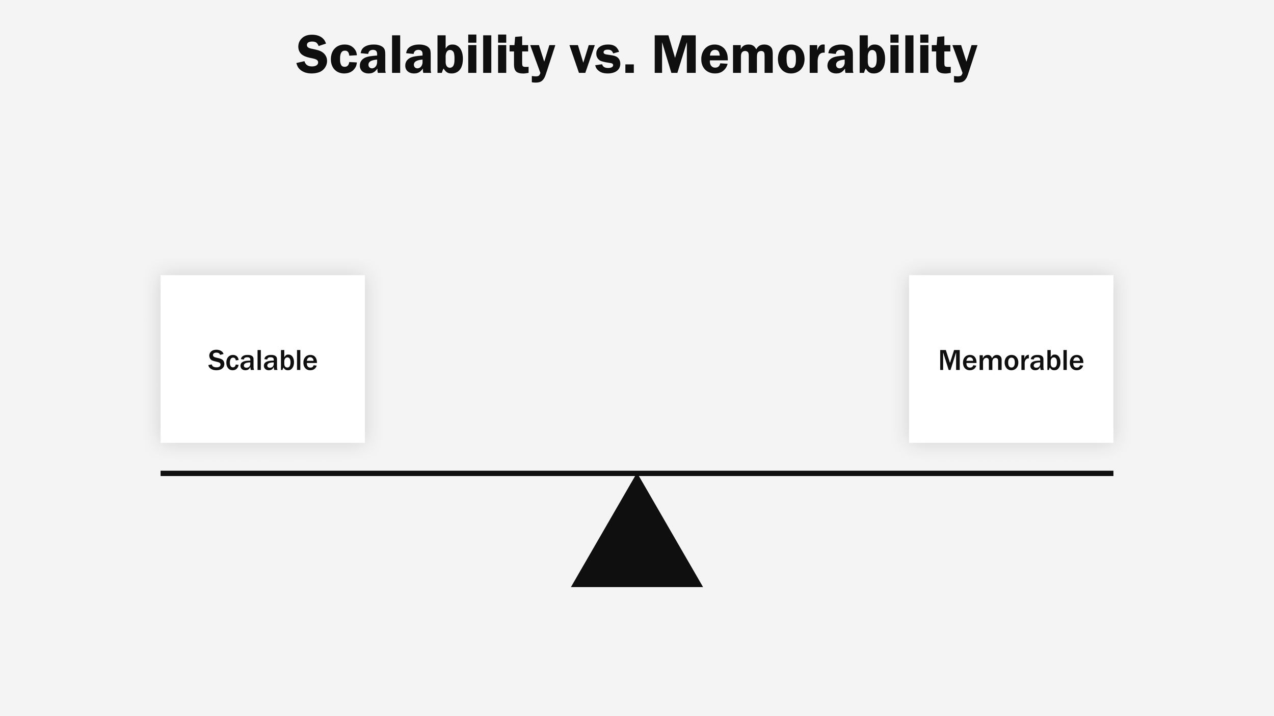
This lever is mostly about the time/effort a visual designer puts into slides. We need our processes to be scalable so that we can hit deadlines, drive business value, and not work 18 hours a day. And at the same time we want our visual content to be differentiated enough so that key concepts are memorable.
To achieve this balance we should consider each slide's individual purpose and value. To illustrate this, the extremes could be:
A 3 part list that appears once in a program isn't something that needs a custom design. Use a template → scalable!
However, a primary program framework should be custom and iterated over time. Make something custom → memorable!
The harder decisions come in the grey area of "should this use a pre-built template?" or "should I make something custom?". This is the magic struggle and fun of being a visual designer! There definitely isn't a specific answer, but by considering your time and the overall impact that a slide will have on a lesson or program, you'll be better at making these calls over time.
📌 For some general guidance, I've noticed that a lesson probably has 1-3 memorable builds (depending on lesson length)
🧱 Flexibility vs. Rigidity
I want to tell you a story to help illustrate this balance.

Australian cattle farmers have thousands of acres of land. If they were to attempt to build fences around all of that acreage, it would take a ton of time and money. And, by the time they finished wrapping all the fields in the fence, it would probably be time to go back and start mending fences. This approach, while effective, is costly and requires a lot of regular maintenance.
An alternative approach is to dig wells. Digging a well in the outback isn't easy, but some initial heavy labor will set the farmer up for a more hands-off future. Once the wells are dug, the cattle know that if they stick close to the wells they will always have water.
That's the approach I've attempted to take with the information design system and its flexibility. A ton of work went into building the system, but now that it's there it operates as a well for the team (I'm not calling you all cattle!). Sure we still have visual reviews, but there is a ton of flexibility within the system as can be seen by looking at how each of us builds visuals.
The application of combining information design system components is flexible while the specific application of each component has rigid rules to follow.
As an example, let's talk about the conversation of whether or not loop callouts should be placed in the same spot on every loop slide.
The overall information design system principle this aligns with is "Elevation & Overlap". The callout is floating and overlapping the loop piece that it refers to.
The rigid aspect is how the callout is used: is the text using the right styling and is there a 30px margin around the text on the callout box.
The flexible portion then is where exactly do the callouts fall on the loop? It really doesn't matter as long as they are overlapping the right loop piece. Each callout will have differing text lengths meaning that our callout boxes will be different sizes and need different spacing on the slide overall.
🙀 Minimalist vs. Overwhelming

This particular balance applies directly to the information design system. When building our system there were 2 schools of thought.
Templatize everything (overwhelming)
Reduce the number of components (minimalist)
Again here, we aimed to hit somewhere in the middle. If we were to templatize everything, there would be so many options that it would be so hard to remember what all was available (you might feel this way already). In the early days, the library was much smaller and required a bunch of repeated tasks (remember that scalability piece).
Striking the right balance is again a bit hard. An example of how this played out in the design system is when Figma released the "variant" feature. Prior to having that we had a bunch of various components that were inconsistently named and didn't contain all the various states that we found ourselves custom-making over and over again.
When we published variants into our information design system it created fewer components overall, but they were better named and had all the functionality and states baked into them.
What we really want is a robust system that is easy to use and locate what you need to speed up the building process.
Conclusion
Being a visual designer at a growing startup is tricky. These are just a few of the areas where we have to think critically on a daily basis. This also means that there aren't always "right" answers, but you have the autonomy to make the best decision with the information you have.
With these levers now documented, we can use them to have a shared vocabulary and better articulate when we hit a snag. The value of having a team like ours is that we can all help each other find the balance when our own equilibrium is thrown off!