Reforge’s Website & Brand Design
My Role: Designer and strategic collaboration
This case study delves into the fascinating journey of Reforge's visual identity over a span of three + years.
Below, we'll explore the evolution of the website's appearance from its early days, and also delve into the recent homepage overhaul that followed a successful rebranding collaboration with Koto.
I'll never forget the email I received when applying for the first design role at the company—a humble Squarespace contact form served as the gateway to this exciting opportunity. At that time the website looked like this:
Most Recent Home Page Journey
A lot has happened at Reforge since that early (2018) site above. We’ve scaled up, pivoted, relaunched offerings, and most recently opened up access to a totally new product offering: Artifacts.
The artifacts team reached out to me to help them re-imagine the home page to better represent what we’d now promote as our main, free offering. There was a PM and a product designer on the team and together we strategized on what the site should contain and how it should flow.
Below is the sequence from the wireframe, through early iterations of the site, to the final product we shipped. And guess what, this is all still in Squarespace!
The site launch went successfully, increasing the conversion rate by quite a few % points in the first few weeks.
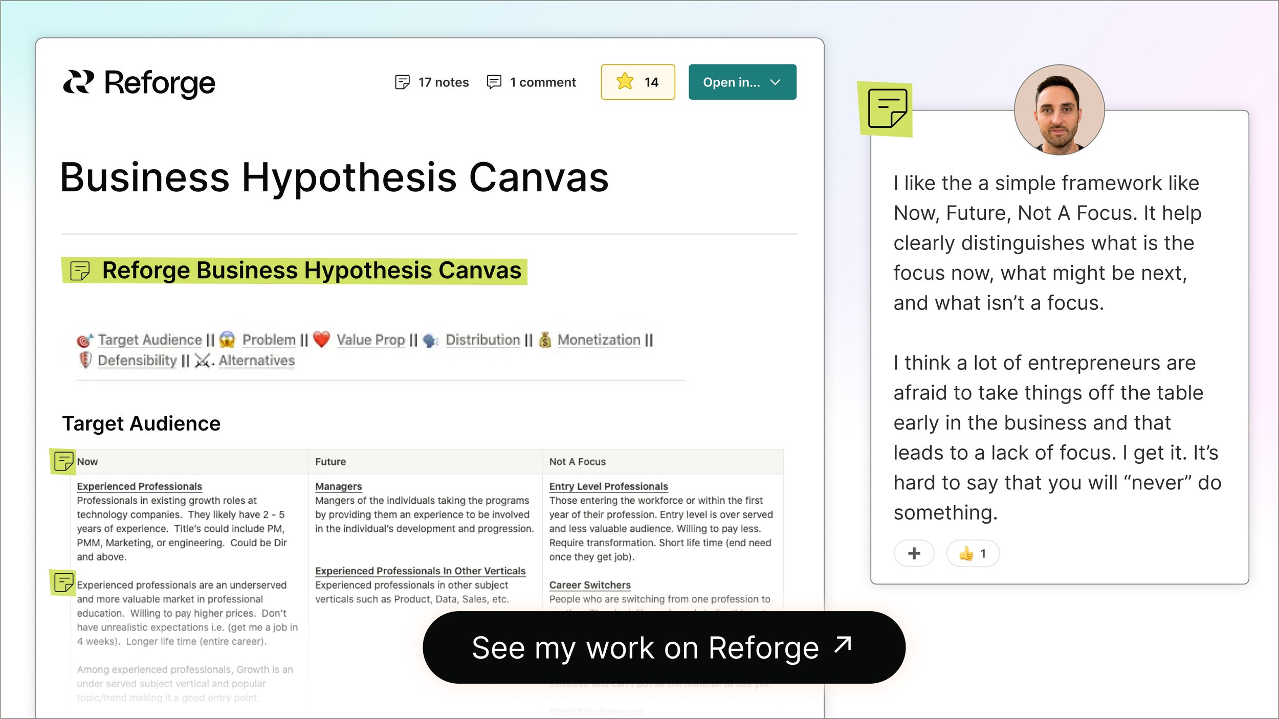
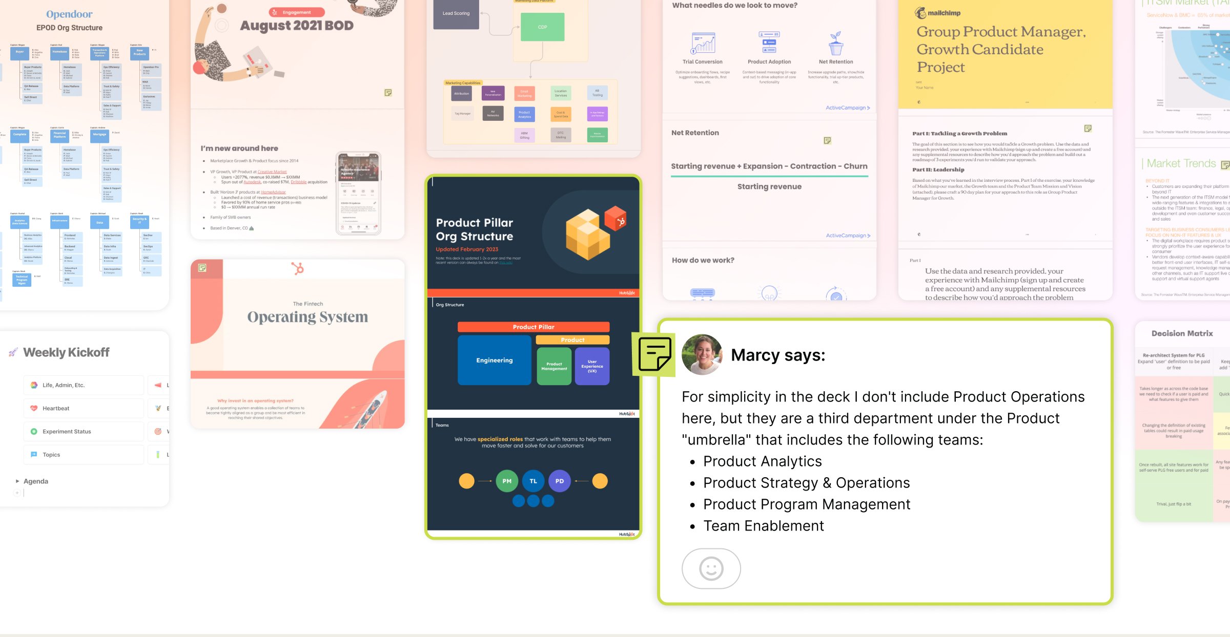
To help drive traffic and generate a buzz about the launch, I created a number of social share images for the company as well as partners. Below is a sample of those graphics.


